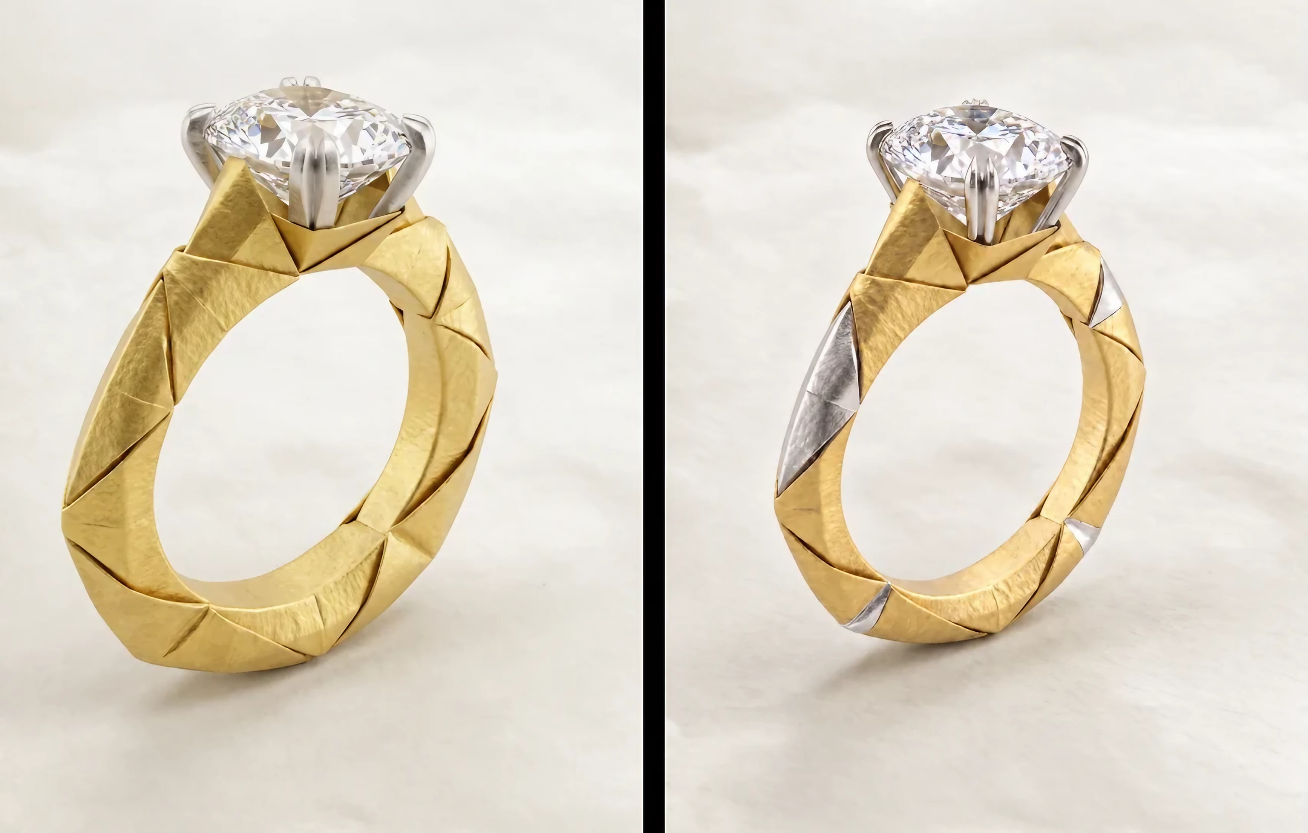
Welcome to our first Prompt Clinic. A few small habits make a big difference to what you get back.
None of these are tricks. They're the same habits that make a brief clear to a bench jeweler: say what you mean, be specific, and say what shouldn't change. Here are five to start with, plus a look at why the AI sometimes misses details that seem obvious to you.
1. Use your own words, not an AI-written prompt
No need to ask another AI tool to write your prompt. Facet Flow already does the prompt engineering for you behind the scenes. Long generated prompts tend to add noise that pulls your design off course. Say it the way you'd say it to your bench jeweler.
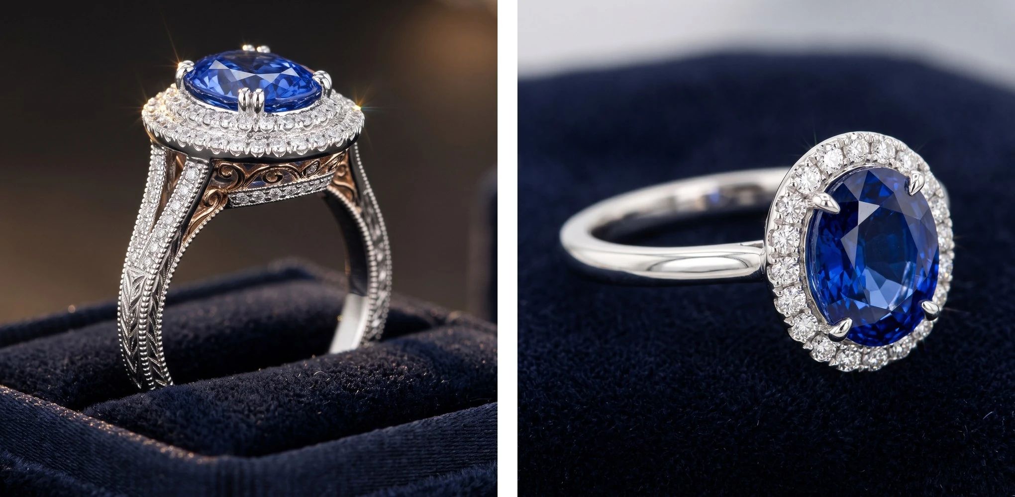
Here's what that looks like. Say you want an oval sapphire in a diamond halo, in platinum, on a thin plain band. Ask a general AI tool to “write a prompt” for it, and you might get something like this:
Create a breathtaking, ultra-realistic, hyper-detailed 8K masterpiece render of a luxurious, timeless, one-of-a-kind heirloom engagement ring that exudes elegance, sophistication, romance, and modern vintage charm. At its heart, a mesmerizing, ethically sourced 3-carat royal blue cornflower oval-cut Ceylon sapphire radiates captivating brilliance, gracefully embraced by a dazzling double halo of ice-white round brilliant diamonds and delicate micro-pavé accents. It rests on an intricately detailed, hand-engraved platinum band adorned with vintage-inspired milgrain edges, Art Deco filigree scrollwork, a hidden halo, and a subtle split-shank silhouette, with rose gold accents for warmth. Cathedral setting, elegant claw prongs, sparkling side stones, and a whisper-thin, minimalist profile. Floating above a velvet ring box, cinematic studio lighting, dramatic rim light, soft bokeh background, shallow depth of field, macro lens, octane render, trending on ArtStation, award-winning jewelry photography, HDR, best quality, masterpiece.
Now the way you'd say it at the bench:
An oval sapphire in a round diamond halo. Platinum. Thin, plain band.
The second prompt is a fraction of the length and says everything you decided. The first one buries your four decisions under more than a hundred words, and quietly adds a dozen you never made: a 3-carat stone, a double halo, engraving, milgrain, filigree, a split shank, side stones, even rose gold. Some of them contradict each other. A band can't be “intricately detailed” and “whisper-thin, minimalist” at once, and it was supposed to be plain platinum.
Why AI-written prompts add noise
A longer, more polished prompt feels like it should give the AI more to work with. Usually, it just gives the AI more to get wrong. Here's why.
- Your prompt is already being engineered. Behind the scenes, Facet Flow turns your request into detailed instructions for the image model, with jewelry knowledge built in. An AI-written prompt adds a second layer on top. It's like handing your bench jeweler a brief that someone else has already rewritten: the two versions can repeat, overlap, or contradict each other.
- Invented details become requirements. A general AI tool fills the gaps with its own guesses, like the double halo and split shank above. The image model can't tell your decisions from those guesses, so it tries to follow all of them, even the ones that contradict each other. Words like “stunning” or “award-winning” don't describe your piece at all, but they still nudge the result toward a generic, stock-photo look.
- Extra words pull focus from what matters. AI models weigh every word in a prompt against every other word. Words that don't matter aren't ignored; they take a share of the model's focus. In one study, adding a single irrelevant sentence to problems a model could already solve made its accuracy drop sharply (Shi et al., 2023). Another found models pay the least attention to what sits in the middle of a long input (Liu et al., 2024). That's exactly where the sapphire ended up in the example above.
- Busy prompts blur details together. When researchers tested 12 image models on long, detail-heavy prompts, even the best attached only about half of the details to the right part of the image, and every model got worse as prompts grew (Jiao et al., 2025). At the bench, that looks like milgrain meant for the band ending up on the halo, or the metal color meant for the prongs spreading across the whole ring.
Length isn't the enemy. Some of the newest image models actually do better with longer, more specific prompts, as long as every detail is one you chose. A prompt in your own words is a cleaner signal, because everything in it is a decision you made.
2. Use numbers and specifics, not vague adjectives
“Thinner” means something different to everyone. Numbers and precise descriptions don't.
Make the band thinner.
Make the band 20% thinner.
Make the stone bigger.
Increase the center stone by 15%. Keep the halo the same.
Make it more elegant.
Give the band a slim knife-edge profile and a high-polish finish.
An adjective leaves the AI to guess how much change you want, so it might barely move, or it might overshoot. A percentage gives it a clear amount, measured against what's already in the image.
Percentages also make your results easier to steer. If 20% thinner isn't quite enough, try 30%. That's much easier to adjust than going from “thinner” to “a lot thinner” to “much, much thinner.”
The same goes for materials and finishes. “Gold” leaves a lot open. “High-polish 18k yellow gold” doesn't. Google's latest prompting guide makes the same point: name the exact material instead of the general one. And swap words like “elegant” or “bold” for the details that create that look: a knife-edge band, a low setting, a brushed finish.
3. Name your references
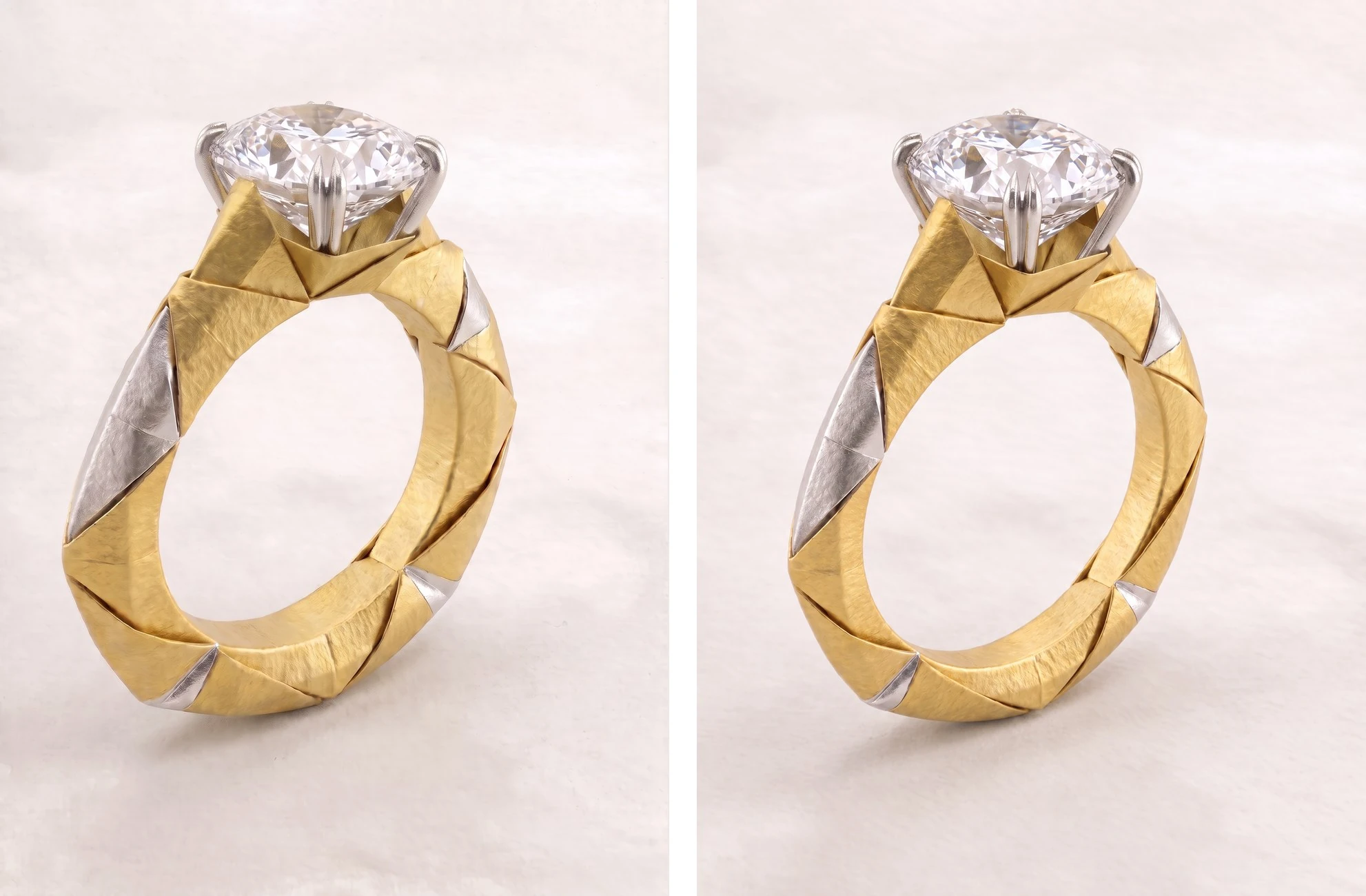
When you upload more than one image, refer to them by number:
Use the stone from image 2 in the setting from image 1.
Without numbers, phrases like “this stone” or “the other ring” leave the AI guessing which image you mean, and it may swap the wrong parts.
It also helps to say what each image is for:
Image 1 is my ring. Image 2 is the stone I want. Put the stone from image 2 into the ring in image 1.
The same goes for parts within an image. “The left earring” or “the stone closest to the clasp” is clearer than “that one.”
4. Say what stays, and break it into steps if needed
When you ask for several changes at once, like a new stone, a thinner band, and a different metal, the result can be hit or miss, even if you specify what should stay the same.
Change the center stone to an oval sapphire, make the band 20% thinner, and switch the metal to platinum. Keep everything else exactly the same.
The AI doesn't edit an image the way design software does. Each generation redraws the piece, so anything you don't protect is open to reinterpretation. Even with clear instructions, some details can still shift, especially when you're asking for multiple changes.
Some changes may also be handled better by different models, each chosen because it does that task best. For now, we recommend breaking more complex edits into steps. Swap the stone first and approve it, then thin the band, then change the metal:
Make the band 20% thinner. Keep everything else exactly the same.
Smaller steps give the AI fewer instructions to balance at once, and let you see exactly what each change did. Be explicit about what should stay unchanged to help prevent your design from drifting.
Describe what you want to see, then rule things out. “Keep the band plain and polished, with no pavé” works better than “no pavé” on its own. Image models are better at following what to show than what to leave out.
5. If a design starts drifting, go back
Return to the last version you liked instead of fixing the one that drifted. It keeps your design intact and saves compute.
Drift compounds. Each generation builds on the image before it, so a small shift in one round, like a prong that's a little thicker or a stone that's turned slightly, becomes the starting point for the next. Try to fix it with another prompt, and you're asking the AI to correct one detail while keeping everything else from a version that's already off. A few rounds later, the piece can look like a different design.
Going back to your last good version resets that. You start again from a design you've already approved, and try the change a different way.
If a single result misses the mark, use the Retry button. It gives your request another try from the same starting point, instead of building on the result that went wrong. Each retry also tells our team where things went wrong, so we can spot the most common issues and keep improving.
Why the AI sometimes doesn't get it
The AI reads what's in the image, not what you intended. So some details are harder for it to pick out than you'd expect.
Text that isn't facing forward
Lettering is a common example. If text in your image is tilted, curved around a band, or turned away from the camera, the AI may not be able to read it. Then it can't tell which text you mean when you refer to it.
This comes down to how image models learn. They see far more examples of flat, upright text than lettering wrapped around a curved surface. When letters bend, shrink, or catch reflections on polished metal, they stop looking like the shapes the model knows. A few things help:
- Point to where it is, not just what it says. “The engraving on the left side of the band” works even if the AI can't read the words.
- Straighten it first. Rotate or crop the image so the text faces forward.
- Make it sharper. Use Upscale to 4K so small lettering has more detail to work with.
Small text is still one of the hardest details for image models. If the exact lettering matters, finish it in CAD.
How it's worn
How a piece is worn matters too. An ear climber, a cantilever ring, or a brooch worn sideways can look like a different piece from a single photo, and the AI may guess the wrong orientation. Tell it directly:
An ear climber, worn along the outer edge of the ear.
Then check the image analysis before you generate, to make sure the jewelry type and orientation were understood correctly.
Send us your toughest prompt
Have a prompt that keeps fighting you? Send it to contact@facetflow.io. We may feature it, anonymously, in a future Prompt Clinic.
Sources
- Shi, F. et al. Large Language Models Can Be Easily Distracted by Irrelevant Context. ICML 2023.
- Liu, N. F. et al. Lost in the Middle: How Language Models Use Long Contexts. TACL 2024.
- Jiao, Q. et al. DetailMaster: Can Your Text-to-Image Model Handle Long Prompts? 2025.
- OpenAI. Image prompting: GPT Image 2.6 prompting guide. November 2026.
- Google Cloud. The ultimate Nano Banana prompting guide. March 2026.