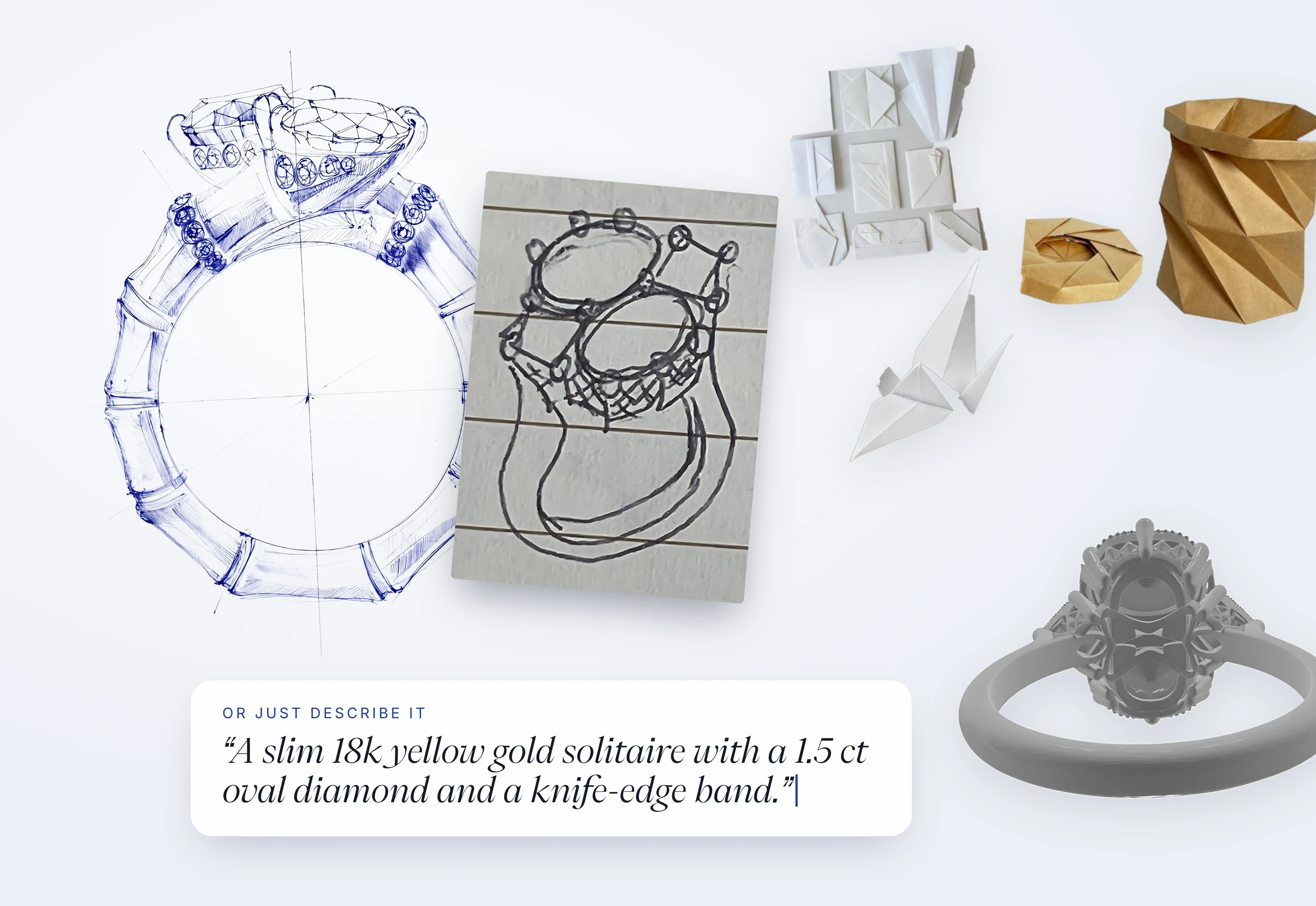
Every design in Facet Flow begins with something you bring. It might be a polished sketch, a doodle on a napkin, a folder of pieces you love, a CAD file, or just an idea you can put into words. There's no wrong place to start, but each one works best with a slightly different approach.
Here's how to get the most from each starting point.
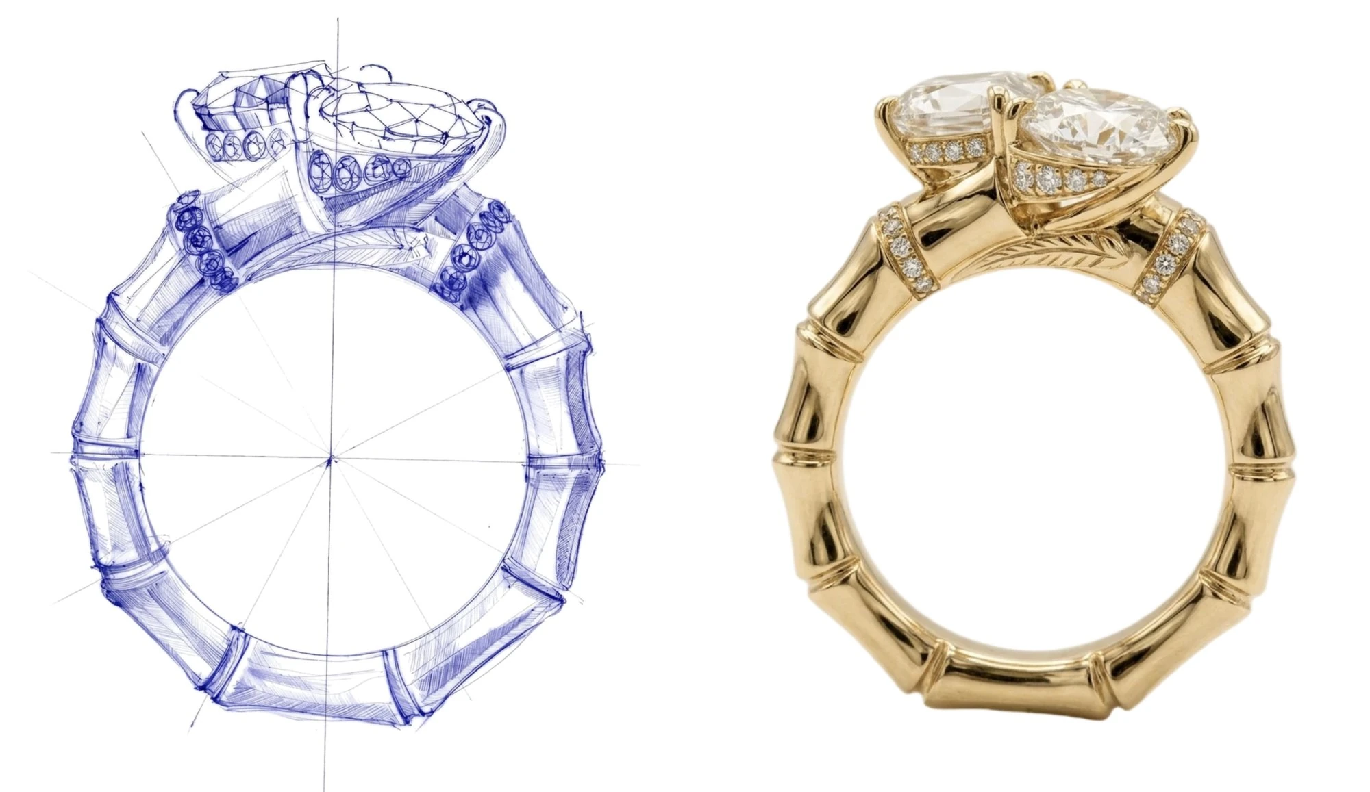
A finished sketch
Upload it as is. A finished sketch already holds your proportions, silhouette, and details, and they carry through to the render. So a short note on metal and stones is all it needs.
For example:
18k yellow gold, cushion and oval diamonds, round diamond pavé on the collars and under each stone.
If there's anything the sketch can't show, like a texture or finish, add that to your note too. And if you want the render to stay close to your drawing, say so: “Keep the proportions and details exactly as drawn.”
A rough sketch, with words or labels
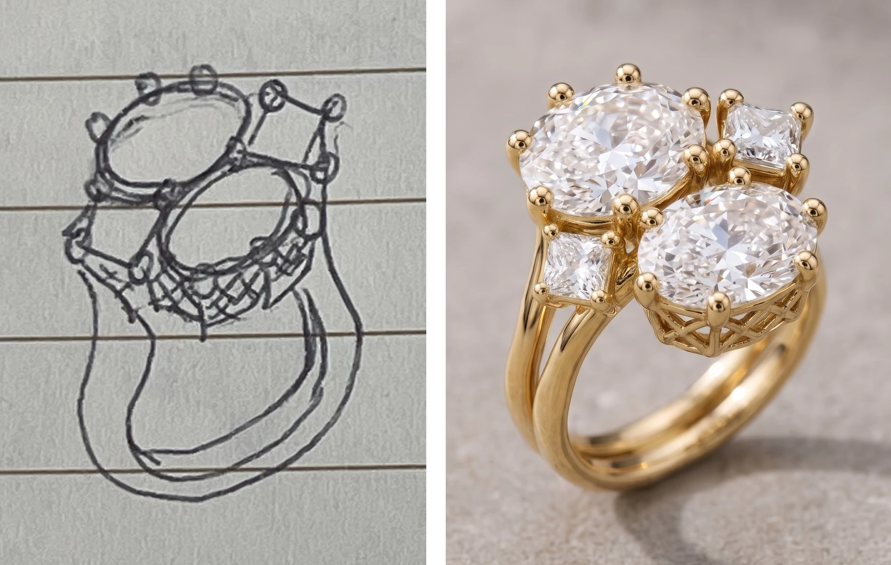
We hear this a lot: “What if I can't draw well?” Don't worry. A rough sketch still works. The sketch gives the shape, and your words give everything else. You can fill in the rest of your vision in one of two ways.
Add a few words in your prompt. Name the jewelry type, metal, stones, and setting. “A cocktail ring in 18k rose gold with an oval sapphire in a four-prong setting and a pavé band” turns a few lines on paper into a clear brief.
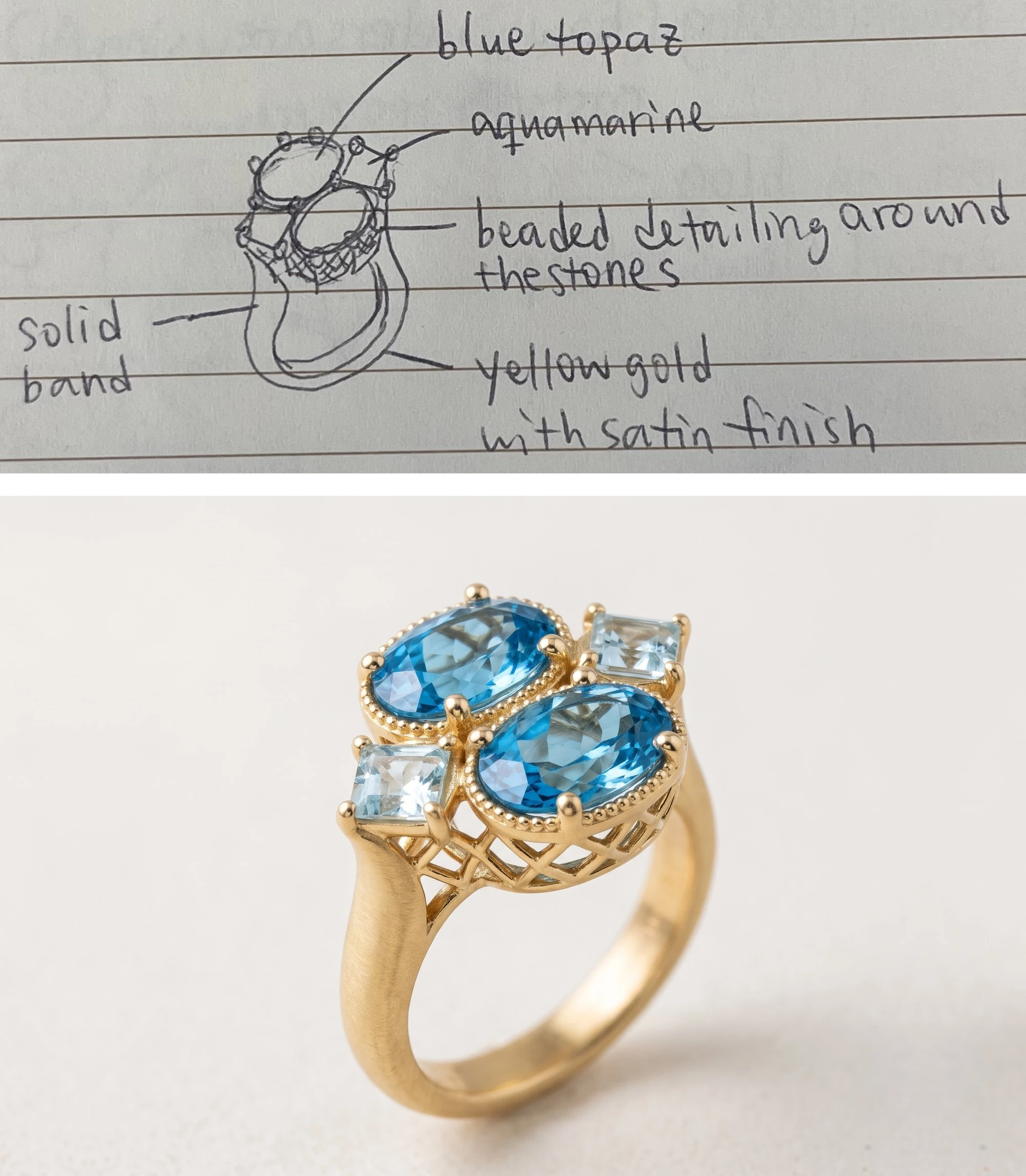
Or label it right on the sketch. Write your notes by hand as you draw, like “18k rose gold,” “oval sapphire,” or “pavé band,” with a line pointing to each part. Facet Flow reads your labels and renders the piece from them. This works especially well when different parts of the piece use different materials, since each label sits right where it belongs.
Here's the difference it makes. First, a rough sketch on its own, with no words:
Now the same sketch with labels, plus a few words in the prompt:
Visualize this sketch. This is an 18K yellow gold ring, satin finish, with a four-stone cluster with raised open baskets. Tapered shoulders. 6 rounded bead-tip claws on the oval heads; four claws on the square accents. 2 oval blue topaz in the center (they are exactly the same) and 2 square aquamarines on the sides. Openwork crisscross lattice under the stones.
References you love, with Jewelry Builder
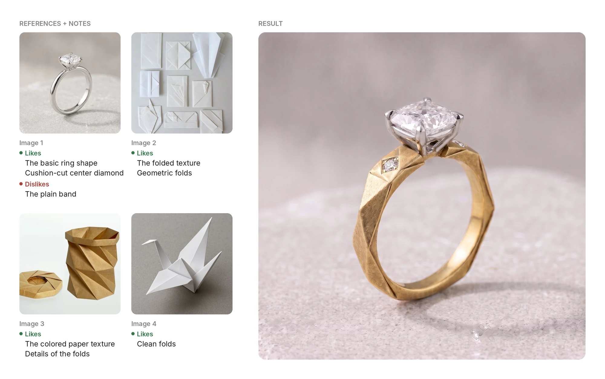
Sometimes the idea isn't one piece. It's the halo from one ring, the band from another, and a feeling from a third. Jewelry Builder lets you bring in the pieces that inspire you and combine them into something new.
The key is to tell it what you like and don't like about each one:
Image 1: love the basic ring shape and the cushion-cut center diamond, not the plain band. Image 2: the folded texture and geometric folds. Image 3: the colored paper texture and the details of the folds. Image 4: the clean folds.
Without those notes, the AI has to guess what drew you to each image. With them, your opinions become the design. The more specific you are about what to keep and what to leave behind, the less the result looks like any one reference, and the more it looks like yours.
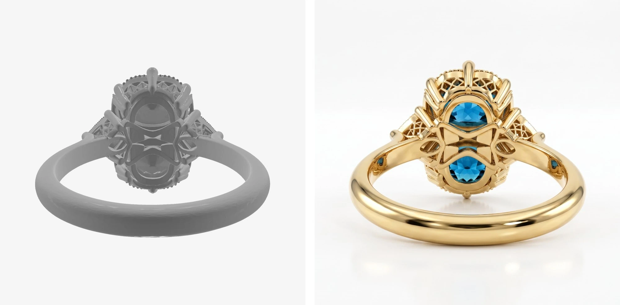
A CAD screenshot
Already have a model in Rhino, MatrixGold, or another CAD program? Turn it into a client-ready render with our CAD-to-Images flow. It helps you show a client what the finished piece will look like before it's cast.
Use one view per image so the design reads clearly. A screenshot with front, side, and top views in one frame can confuse which view is which. If you need several angles, upload them separately.
CAD screenshots also don't always show metal and stones the way they'll look in real life, so confirm them in your prompt:
18k yellow gold, oval blue topaz, high-polish finish.
A written description
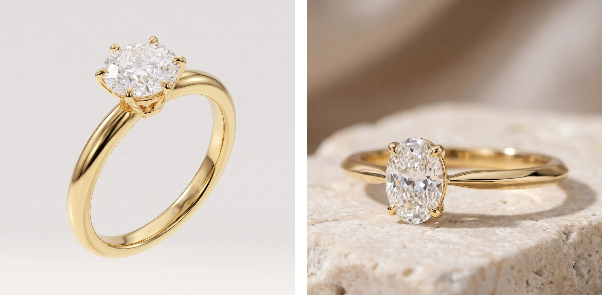
No image needed, but detail matters. A generic prompt will only give you a generic design. Compare these two:
A gold ring with a diamond.
A slim 18k yellow gold solitaire with a 1.5 ct oval diamond in a low four-prong setting and a knife-edge band.
The first leaves almost every decision to the AI. In the second, you make those decisions yourself: the metal, the stone's shape and size, the setting height, the band profile. A useful checklist is jewelry type, metal, stones (shape, size, color), setting, and any details that make the piece yours.
The more of your vision you put in, the more the result looks like yours.
One habit for every starting point
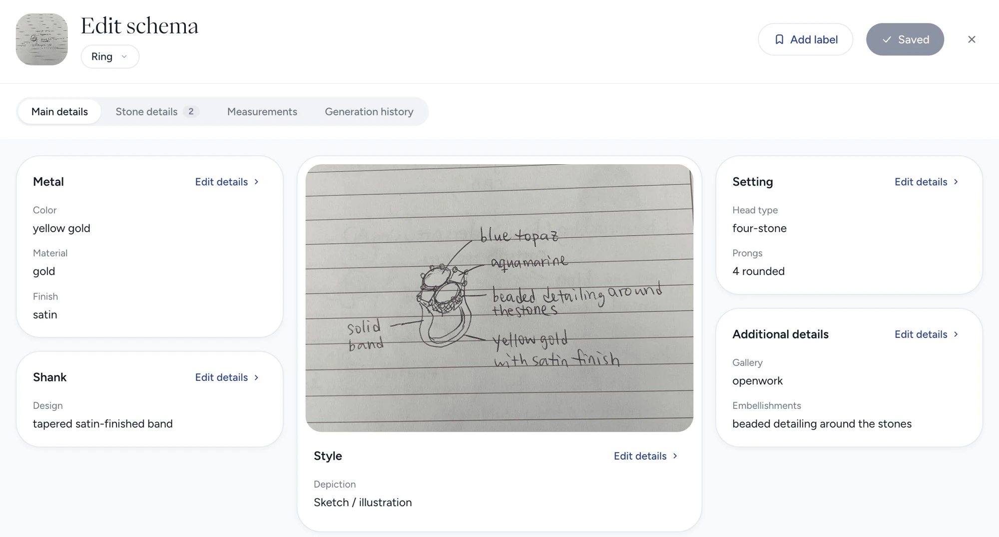
Check the image analysis before you generate. It shows how Facet Flow understood your design: the jewelry type, the materials, the stones, the setting, and how the piece is worn. For a labeled sketch, it also shows whether your handwritten notes were read correctly.
If something is off, like a cocktail ring read as a band or “rose gold” read as “yellow gold,” correct it there. A small fix at the start saves you from chasing the same mistake through every version that follows.
One more thing helps the analysis get it right: crop your image before you upload it. If the design is small in the frame, or surrounded by paper lines, a desk, or other pieces, crop it tight around it. Everything else in the frame is noise the AI has to sort through. Zooming in on the design also gives it more to work with, so small details like prongs, beading, or a texture don't get lost.
Start with what you have
Whatever you bring, the best results come from the same place: your ideas, your references, and your knowledge of how a piece should look and wear. Facet Flow takes it from there and helps you explore it further.
So start with what you have. A sketch, a screenshot, a few words. It's enough to begin.